OPINION:
Wellington's new giant sculptural sign on the waterfront is cringeworthy and an unimpressive addition to a city in need of a rethink.
A press release says it's likely to be one of the capital's "Instagram-able moments of the year", but I'm not convinced people will know what to do.
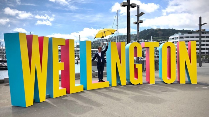
The WELL_NGTON sculpture is missing the letter "I" so that one person at a time can stand in the middle of the sign to become the "I" and get their photo snapped.
It just looks like a giant spelling mistake.
This morning, two women walking past the sign literally asked: "Where's the I?"
WellingtonNZ chief executive John Allen explained to them the idea was that they were the "I".
The whole thing is comical.
What's not funny is that the budget for the project was $130,000, which included design, manufacture, initial installation, two reskins of the sign, as well as removal from the waterfront and installation at a different location.
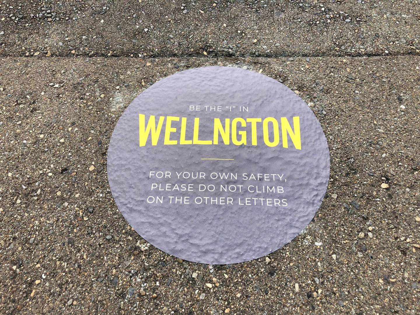
A notice by the sign warns people not to climb on the other letters. Photo / Georgina Campbell
The sculpture was commissioned by WellingtonNZ – the region's economic development agency, which is 80 per cent owned by Wellington City Council and 20 per cent owned by Greater Wellington Regional Council.
So, to be clear, it is separate from Wellington City Council, but still benefits from ratepayer funding.
The money for the sign has been spent at a time when the council is cash-strapped, pipes are bursting, rubbish isn't being picked up on time, buildings are shut for earthquake strengthening, and transport solutions are moving at a glacial pace.
That's not to say the city can't have nice things while it sorts out its infrastructure crisis, but this sign isn't nice. It's just embarrassing and a waste of money.
The design is meant to foster a feeling of "I belong in Wellington" and it's hoped both locals and visitors will get on board.
I suspect efforts to make people feel they belong in the city would be better spent on getting affordable roofs over their heads.
I'm also sceptical about the number of visitors the sign will actually get to welcome with the borders shut and Omicron on the way.
Mayor Andy Foster liked that the sign could be moved around and dressed up for other events and activities in the city.

Wellington mayor Andy Foster. Photo / Mark Mitchell
He thought the spend was justified by how many social media hits the sign has already generated.
He reported 120,000 people were interested in the first 13 hours, which he said suggested other people thought it was "pretty cool" as well.
However, getting traction on social media doesn't necessarily equate to good press.
A sweep of social media shows not everyone thought the sign was cool if comments like "ugly" and "just looks dumb and won't age well" are anything to go by.
The official hashtag to use when posting photos with the sign is #inwellington. A search on Instagram this afternoon revealed WellingtonNZ, Wellington City Council, and Bryce Edwards had posted a picture using this hashtag.
The sign is bright yellow with parts painted in red and teal. It sits just over 2.2m high and 8.9m wide. Each letter weighs between 80 and 120kg.
Wellington's waterfront is a beautiful part of the city and the sign does feel like a bit of an assault on the senses.
This week's A Capital Letter column argued the city's streets are tired and being outshone by Auckland, but this sign is not what I had in mind for Wellington.
- by Georgina Campbell
Take your Radio, Podcasts and Music with you