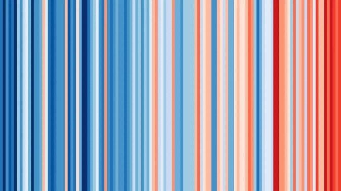
MetService has shared a worrying image detailing the impact climate change has had on New Zealand's yearly average temperatures.
The weather agency's post was part of Show Your Stripes Day, when thousands of people around the world unite against climate change by sharing a striking climate change picture.
The image shows how temperatures have increasingly risen over the past 122 years, highlighting the worrying impact climate change is having on our environment.
Taking to social media, Metservice explained the image, which shows an increasing number of red bars over the past 30 years.
"This image shows how the temperature in New Zealand has changed since the start of the 20th century compared to average (1971-2000)," they wrote.
"Each bar represents a year of the last 120 and shows how the temperature differs from average – blue is cooler than average and red is warmer than average. The darker the colour the bigger the difference.
"You can see we've a lot more red in the scale in recent years. Here in New Zealand we've seen the average temperature increase by 1.3C since 1910.
"It may seem like a small number but it is part of a big problem."
The image was shared by researcher Ed Hawkins from the University of Reading in the UK.
Another graph on Show Your Stripes shows the Earth's temperatures on average have risen each year for more than 20 years in a row.
/cloudfront-ap-southeast-2.images.arcpublishing.com/nzme/JOAO5FNY5GJQHRZX5WOHWNJDWA.jpg)
The average temperature change in New Zealand since 1901. Photo / Ed Hawkins / Show Your Stripes
/cloudfront-ap-southeast-2.images.arcpublishing.com/nzme/IX5OFBHDTA5WIEBH5CDOQ6UL7A.jpg)
The globe's average temperature change since 1850. Photo / Ed Hawkins / Show Your Stripes
Kiwis weighed in on the graph released by MetService and Ed Hawkins, with some concerned about climate change and what it means for the future.
"Wow, this is scary I don't like to think about what the next 100 or even 50 years look like, but this is a good post as it shows a clear picture of climate change in NZ," one concerned Kiwi wrote.
One farmer wrote: "Thanks Metservice and Prof Hawkins. This data really hits home what we have been experiencing on farm over the last 10 years or so.
"Fully behind a lower emissions economy but let's not forget we need to invest in adapting to the climate change highlighted here. Combined with less predictable rainfall we have a huge challenge to support communities through change over the coming decades."
A third added: "Like the glaciers in the Arctic that have almost entirely vanished in the last 60 years that'd been there for hundreds of years previously. Terrifying."
Take your Radio, Podcasts and Music with you


